This is the rebrand for Utopic Villa, a short-term rental company with properties across California, Miami, Arizona, and San Sebastián.
From the start this was meant to be a deep rebrand, one that would move the whole company and every department behind it, not just the way the brand looked. I worked as Art Director alongside Marta as Creative Director and Victoria as videographer, leading the visual direction and the photography across the properties.
Utopic Villa had already been running as a business for three years. It managed a group of houses across California and rented them on Airbnb under the promise of luxury villas.
At some point the bookings started to drop, dramatically and consistently over time, which forced a rebuild of the brand from the ground up. On top of that, the company wanted every house to feel like part of the same brand, so that a guest staying in one of them would understand they were all run by the same company, and so the brand could finally hold a clear position of its own.
The challenge was twofold: understanding what had stopped working, and building a brand strong enough to hold every property together.
Before touching anything visual, the team went through two to three years of booking and customer data the company already had, and what came out of it was that the luxury promise had been speaking to the wrong audience the whole time.
People who actually live in that world have their own platforms for it, and they can tell the difference between a real luxury property and a large, comfortable house. They were never really the ones booking with Utopic.
The people who did book were looking for something else. A place big enough for the whole family or for a group of friends, with a pool and room to breathe. For that kind of guest, the houses were exactly right.
Therefore, Marta and I started rebuilding the brand from its core.
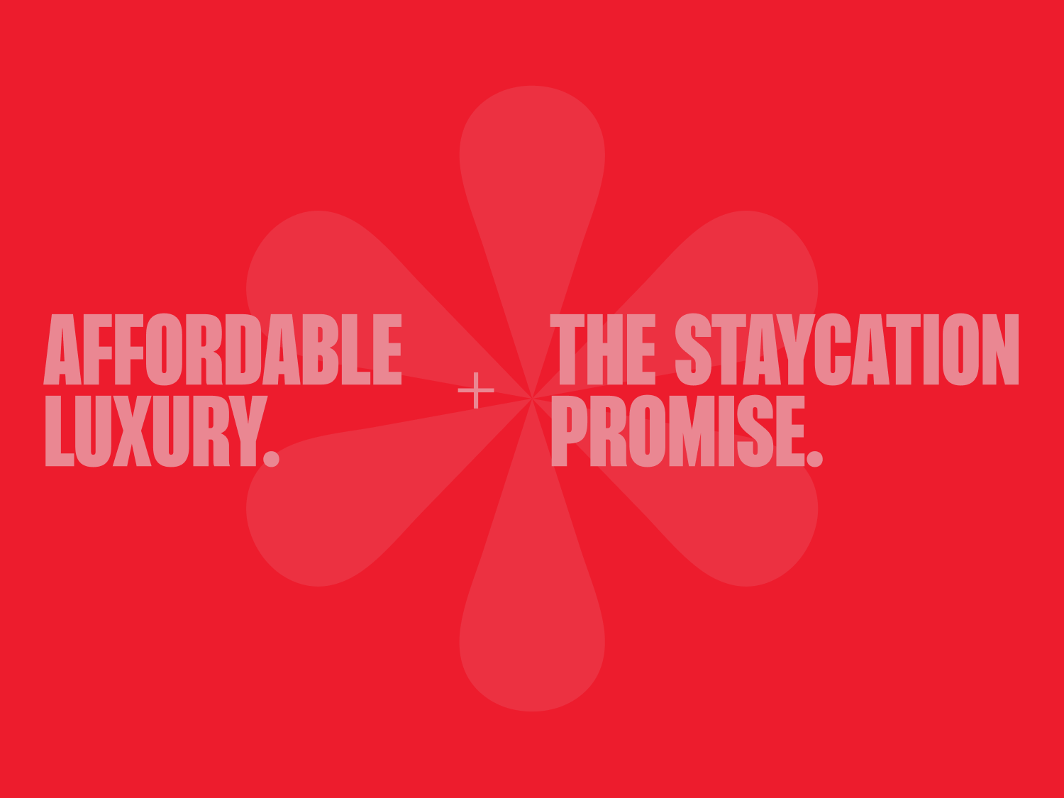
We moved it away from luxury for people who already had it, and toward affordable luxury for people who wanted their own version of it, stepping away from the luxury resort idea they were promising, and building the idea that Utopic's villas could be your own "vacation home" for a weekend.
That shift is what everything else was built on.
The data also pointed us toward how people were actually using the houses, which was barely leaving them. What they were after was a staycation, the vacation was staying in.
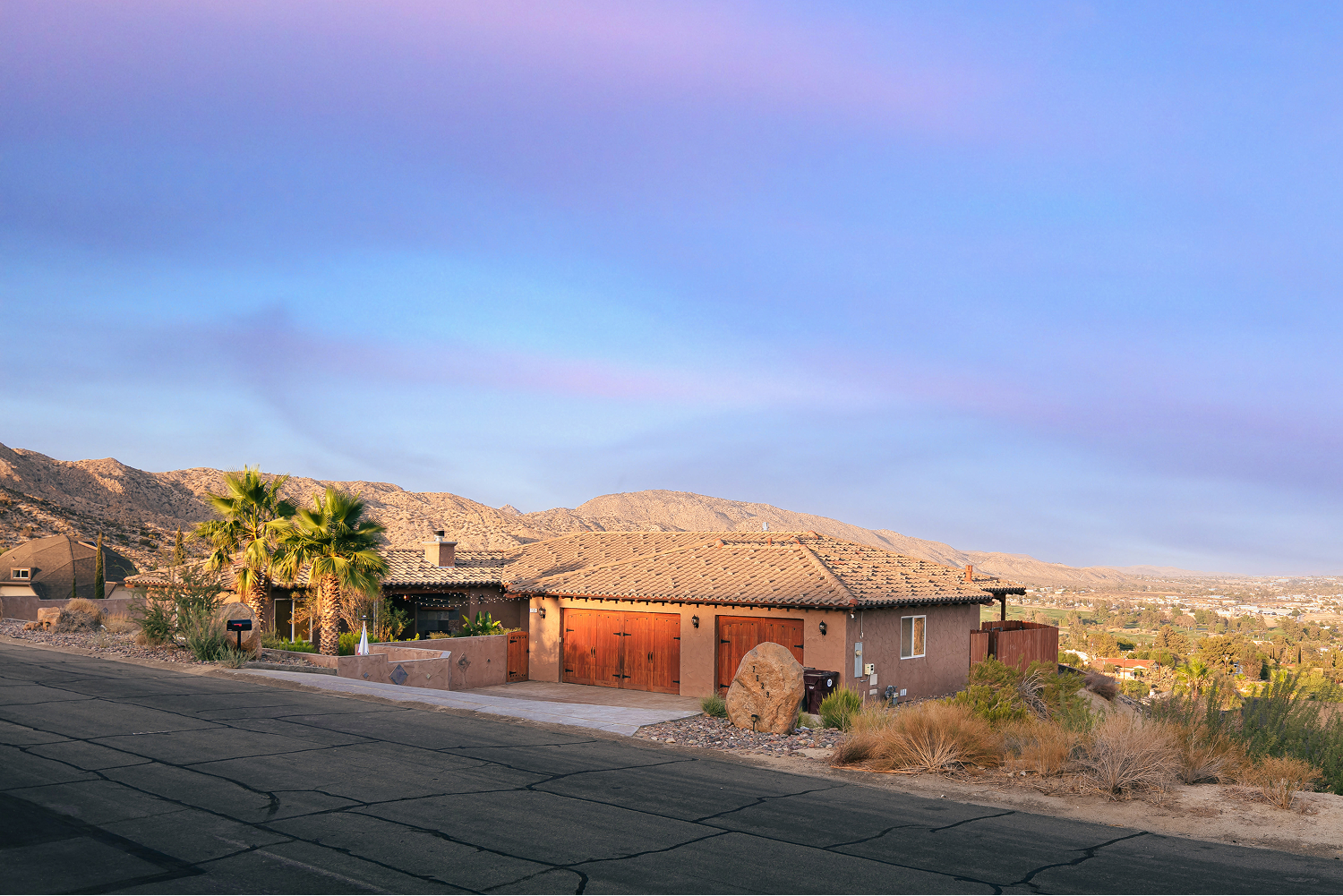
And it actually matched the location of the houses. Almost 70% of them were in Palm Springs, where people would rent the house, slow down, read, cook, use the pool, and barely leave.
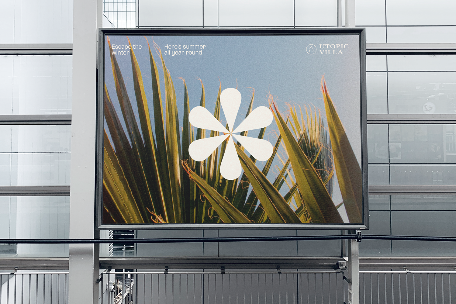
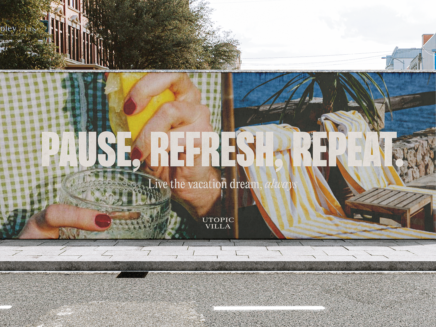
So the "Permanent Vacation Feeling" was constructed as the brand's core. The idea that the house itself was the destination, and the whole point was to stay inside it.
Everything after this point, the visual language, the icons, the interiors, the photography, traces back to that one idea.
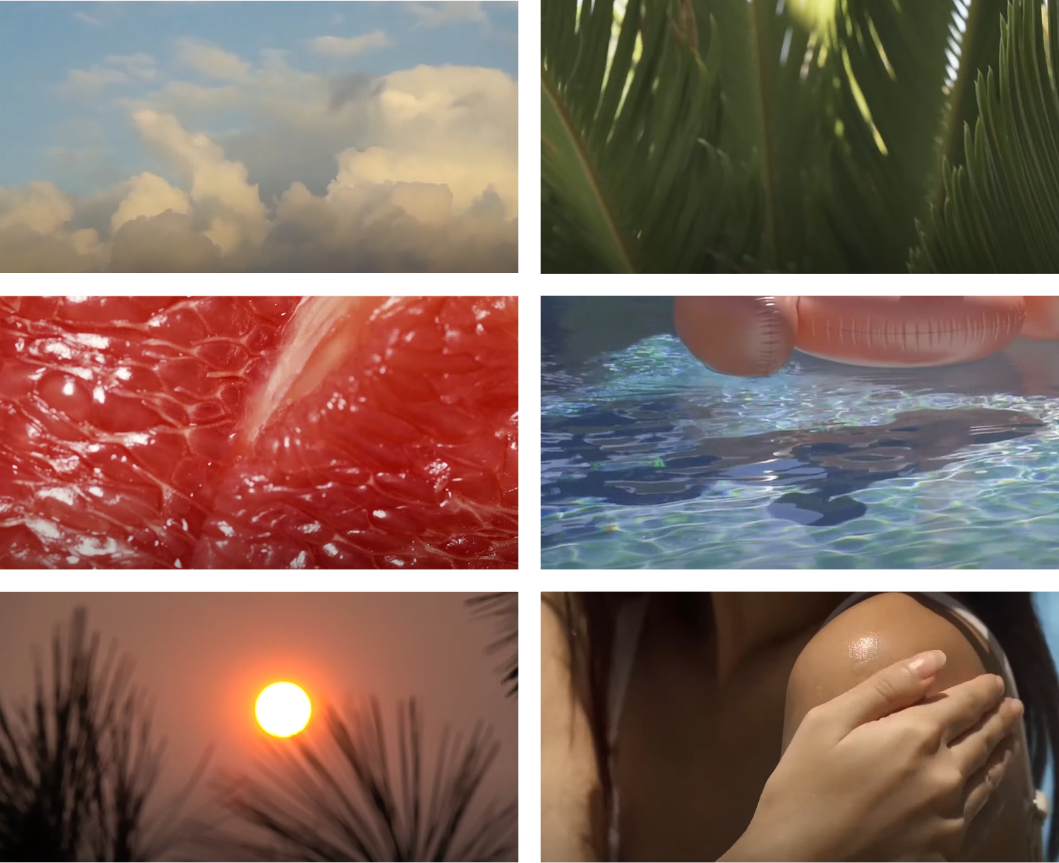
Frames of the brand's concept video.
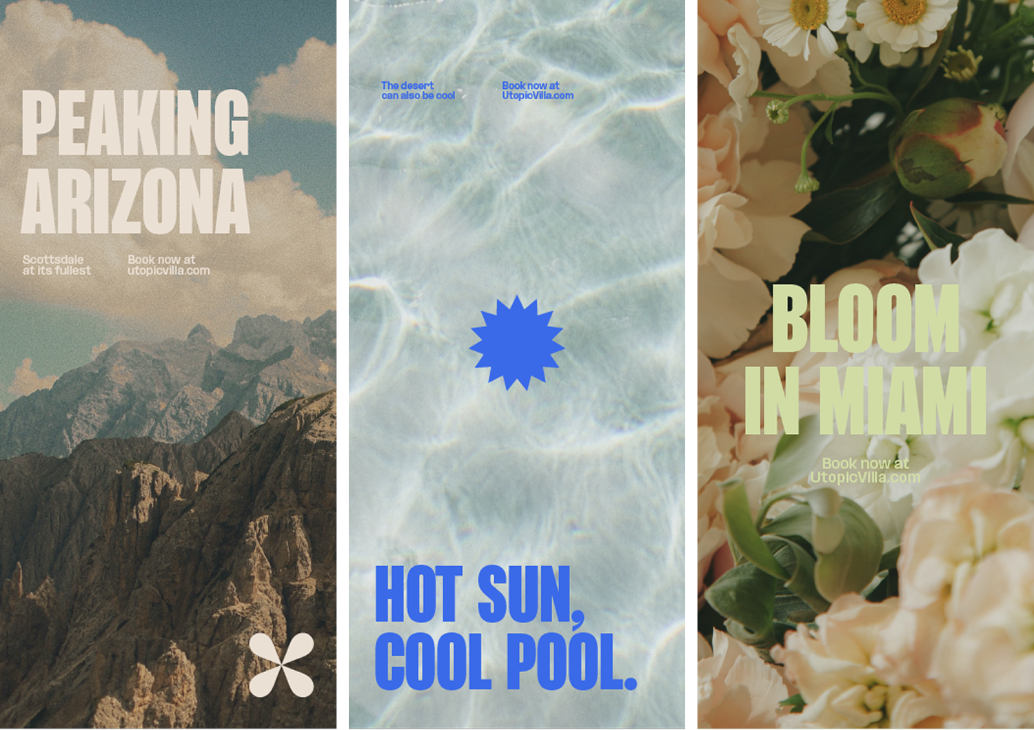
We wanted the different locations to feel unified under the larger brand, almost as a layer of sub-branding inside it.
Drawing from the way a resort earns its stars, we built a system of flower-based icons, one for each city, starting with the flower for Palm Springs and creating the rest from there. There are several houses per location, so each marker stood for a city rather than a single house.
It was a way of giving every location an identity of its own while keeping them all under the same brand, and the system was built to grow, so a new location could join without breaking the logic. This was how the houses finally read as one company instead of a handful of separate listings.
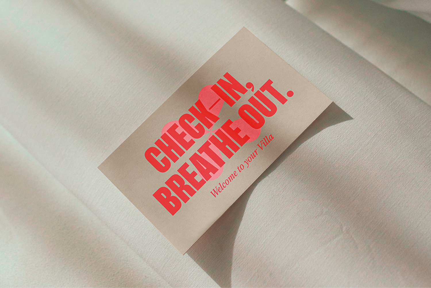
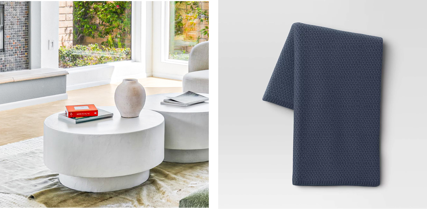
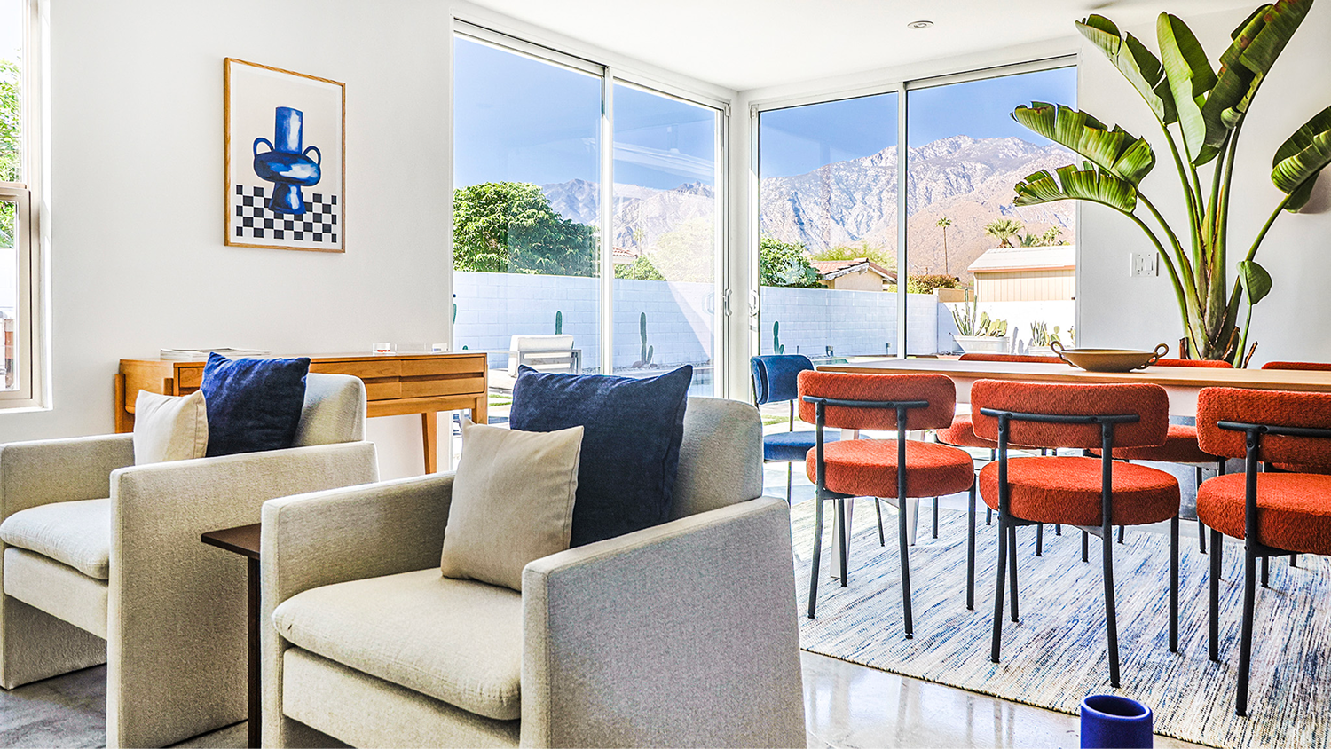
The rebrand went past the screen and into the houses themselves. Working with the interior and architecture teams on the first properties, we brought the brand into the physical space, not only through the decoration but through the experience of being inside it.
That meant deciding on a record player and vinyl in the living room, on the scent of the soaps in the bathroom, on the coffee table books, the small things a guest notices without naming them.
The "Permanent Vacation Feeling" had to be something you could touch, hear, and smell, and this was where the rebrand stopped being a visual one and started reaching into every area of the business, from the website down to what sat on a side table in one of the houses.
Photography carried most of the weight, and I led the shoots across the California properties while working from Madrid, which meant directing everything across the time difference and never being on set. That was part of the challenge.
The other part was the balance we were after. The houses had to look editorial, like something out of a magazine, but they also had to feel livable. Not those sculptural homes where you don't dare sit on the sofa because you think you'll stain it. Somewhere you actually want to be.
So every shot was directed around that. Warm light, the pool, the calm of a slow afternoon, the feeling of a place you could move into for the weekend.
Part of the same business goal was keeping the brand alive outside the vacation itself. A person goes away for a weekend, not for the whole year, and we wanted to stay in contact with them the rest of the time.
We did that through the same sensorial experience, sharing what book we were reading, what music we had on, the food or recipes we liked. Small fragments of the vacation that someone could bring back into their own day to day, replicating a little of that feeling at home through the same senses we had built the brand on.
In the six months after the rebrand, the account grew by more than 2,000 organic followers.
What stayed from Utopic was the way the whole thing held together. A business problem read through real data, a repositioning that came out of it, and a brand that reached all the way from the strategy down to the scent of a soap in one of the houses. Every piece pointing back to the same idea, that the house itself was the vacation.