Knoll Printing & Packaging is the leading global provider of prestige packaging since 1984, designing and manufacturing for brands like Chanel, Guerlain, Tom Ford, and Bulgari.
I led the full website redesign, from strategic audit and information architecture to art direction and Webflow development.
The goal was to modernize how the site looked and rebuild how it worked, turning a static showcase into a structured experience that guides each visitor toward a single, clear action.
You can visit the new website here.
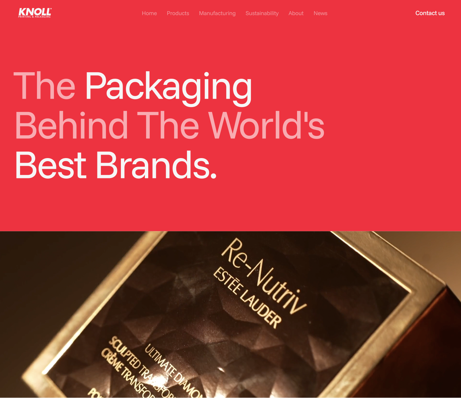
Knoll had spent four decades building packaging for the most demanding brands in the world, but its website no longer reflected that standard.
They came looking for a site that matched the company they are today, and a move to Webflow to get there. The old site ran on custom PHP with no real CMS, and it worked as a catalog with image sliders and product grids that showed everything Knoll could do and left every visitor to find their own way.
Getting to the site they wanted meant starting before the visuals. A site that looks the part but still leaves people lost doesn't fix the problem, so the first question wasn't how it should look, but how it should work.
Every decision after that traces back to the one thing every visitor is silently asking: “can Knoll make what I need?”
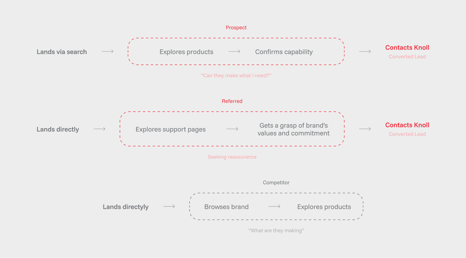
Rethinking the structure started by questioning who actually lands on this site, and what exactly is each of them looking for?
We identified three types of users:
- A prospect who found the company through web search and needs to know if knoll can make their product.
- A referred client who already knows the work and is looking for the final push to commit.
- Competitors checking what the industry leader is making.

Most of the site is built around the prospect, the visitor Knoll most wants to turn into a contact.
That visitor arrives wanting to be sure Knoll can make their product, and Knoll wants the lead. So the whole journey is built around two things: showing the products well, and keeping the contact form within reach.
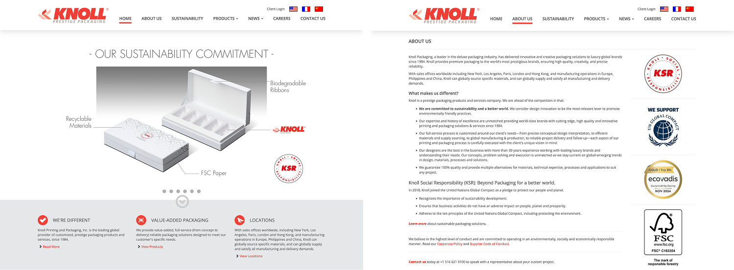
Around that core sit a few supporting pages, (manufacturing, sustainability) that position Knoll within the industry. They rarely close a first-time prospect on their own, but for an undecided or referred visitor, the brand values behind them can be the deciding factor.
Once the audience was clear, the copy became its own layer of the work.
The site had to speak to all three visitors at once, so the messaging was built as a system of headings and subheadings, each carrying the ideas Knoll wanted understood:
- The quality of the materials
- The weight of their legacy
- Their social commitment
Each line answers a visitor before they have to ask, without any of those messages competing for the same attention or turning into a wall of text.

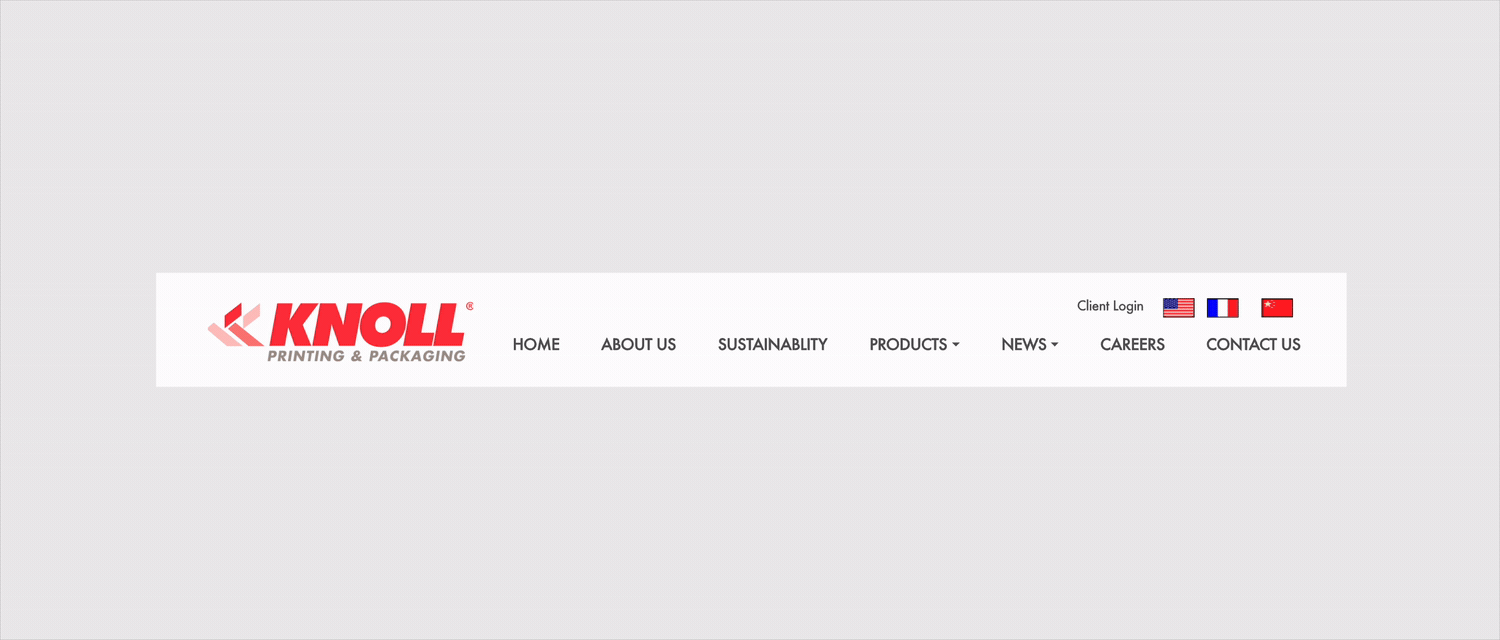
The old navigation worked the wrong way around. It expected the visitor to already know what they were after, when most of them arrived with a question, not a destination.
The new structure is ordered by intent. Products comes first, because it is what the prospect came to see.
Manufacturing earns its own place to answer the capability question up front, something Knoll specifically wanted the site to carry. And Contact stays in sight the whole way, since the entire journey is built to end there.
If the visitor's question is whether Knoll can make what they need, then finding the right product has to be effortless.
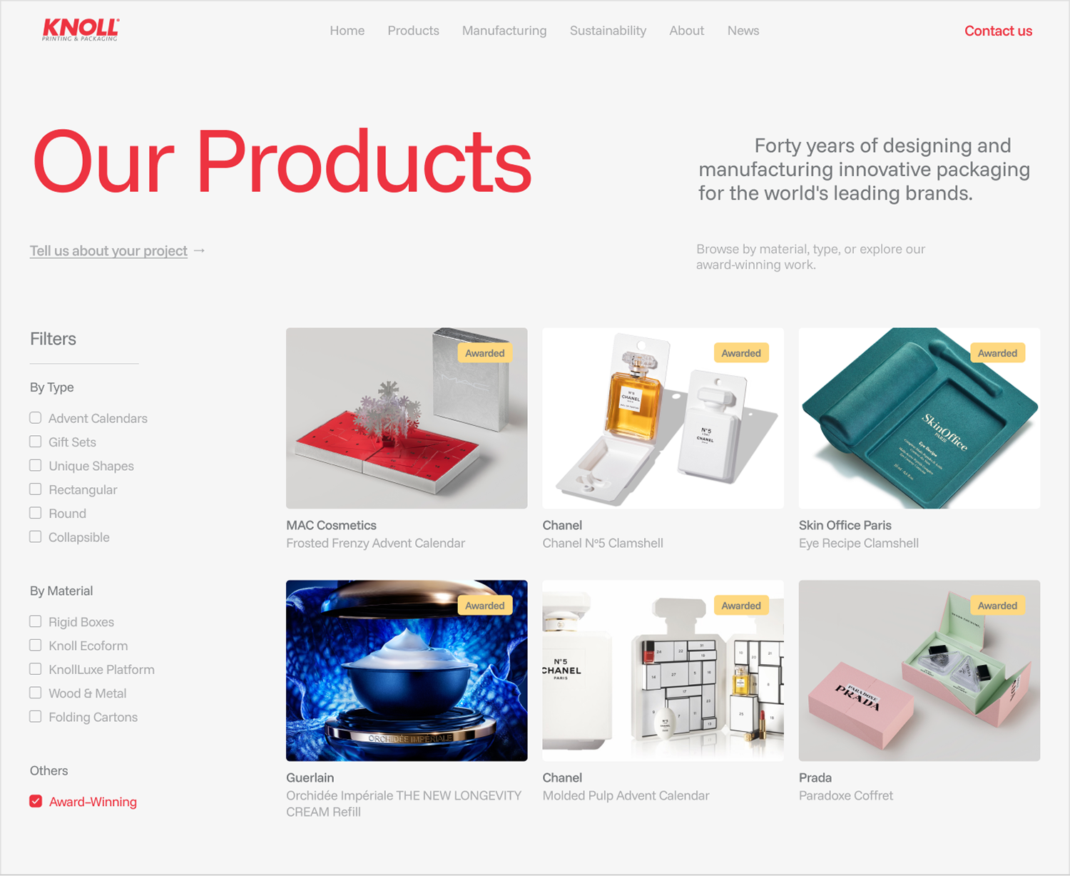
The product catalog is the heart of the whole site, the one place every prospect ends up, so the experience of moving through it had to carry the most weight.
It runs on a filtering system organized by line, by material, and by whether a product has been awarded.
A visitor can narrow a large body of work down to exactly what they are looking for, searching the way they actually think, from what they need rather than from what Knoll happens to show first.
That last filter does something quieter too, surfacing Knoll's recognition right at the moment someone is evaluating.
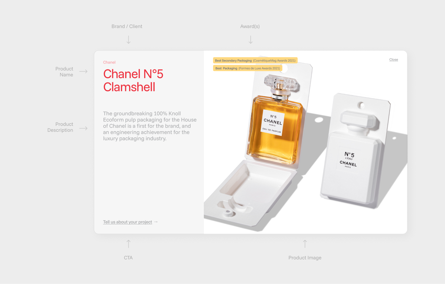
Once a visitor finds something, each product opens in a modal with its detail, the product, its line, and the brand behind it.
Filter down to what you need, then see everything about it without losing your place. It answers the capability question quickly and keeps people moving toward contact, instead of browsing in circles.
All of these strategic decisions still had to live inside Knoll's brand, and Knoll was specific about the balance they wanted: an engineering company, present enough to feel current, restrained enough to never tip into a design studio's portfolio.
It came down to a few decisions
- Holding onto the red and white that make Knoll recognizable.
- expanding the typographic range around them, so the brand still reads as itself but on its best day.
- Building the text with structure, using indentation and hierarchy to carry weight rather than decoration.
The result reads as knowledge, design, and engineering, which is exactly what Knoll sells.

Motion and interactions finished the job. The old site stood still, like watching a slideshow.
That stillness was a big part of why it felt dated. Now content comes in as you move down the page, and small interactions follow you along the way, guiding without ever getting in the way of the conversion the whole site is built for.

The redesign gave Knoll a website at the level of the brands it serves, and a system its team can run on their own, built in Webflow so they can add a product, post a job, or publish news without going back to a developer.
It also ships in English and French, so Knoll meets its international clients in their own language from the first visit.
For a company that has spent forty years earning its place among the most demanding names in luxury packaging, the site now anchors how it holds that place. It is also setting the standard the rest of Knoll's identity is starting to follow.
You can check the live website here.
