Cranes Intelligence Labs is a Bangalore-based engineering intelligence company with thirty years of IP behind it, working across defense, space, aerospace and automotive.
They arrived with a very detailed strategy already thought out on how they wanted to be perceived and how to structure that.
The work was then turning that messaging strategy into something visible and palpable, running from the visual identity through to the website.
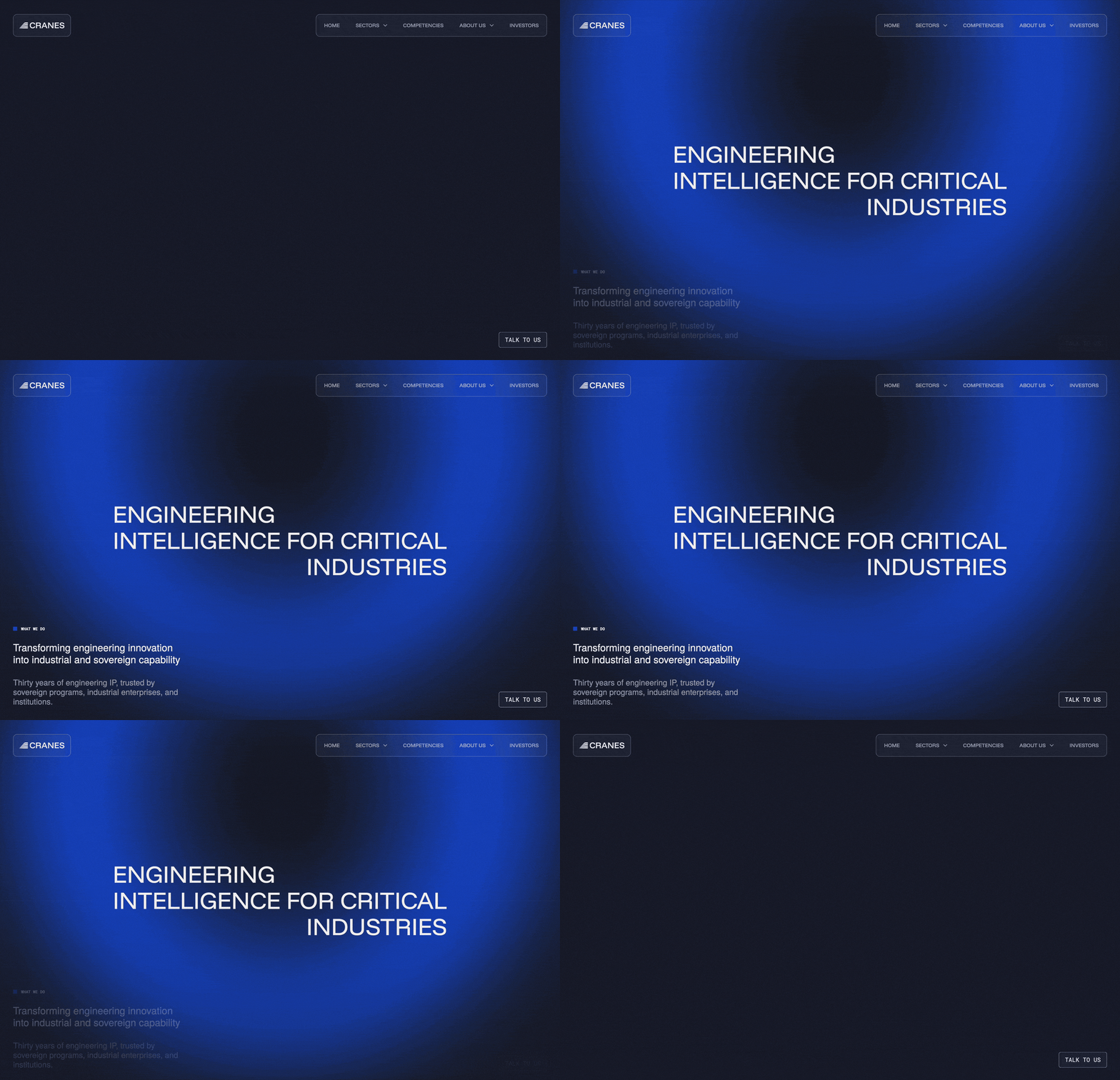
I designed and built the new website, where the company reintroduces itself after thirty years. You can find it here.
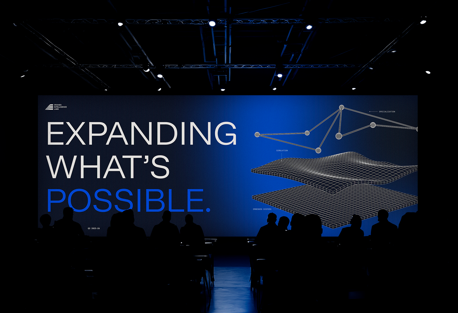
Cranes has been acquiring, developing and deploying engineering software since 1990 and its IPs sit inside institutions in thirty-nine countries, but the brand you met online was still visually anchored to the early 2000s.
For a technology company to be tied to the past works directly against them. They saw it themselves, and the whole project came out of wanting to close the gap between what they build, what they promise, and how the company actually shows up.
This is where it landed.
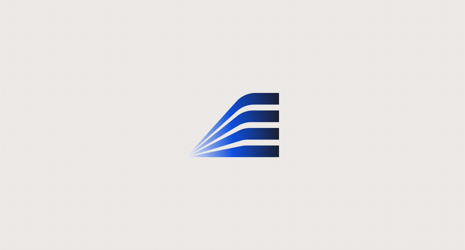
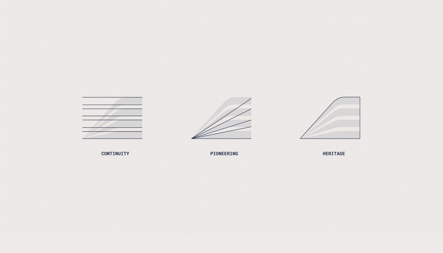
After thirty years and the cultural and sector reach they had, they wanted the new logo to carry on that heritage while also projecting into the new phase they were embarking on. So the challenge became how to balance the past, the present and the future in one logo.
Much of the conversation went into separating what a symbol can genuinely carry from what belongs to the rest of the system, while staying out of the visual territory every AI company is launching into right now, which would have made a thirty year old engineering firm look like it started last year.
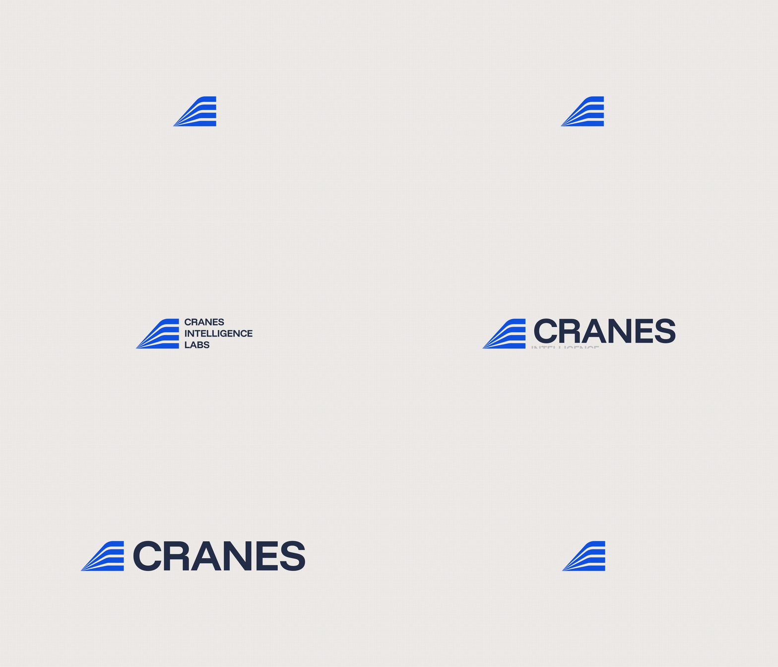
The horizontal cuts carry over from the original Cranes wordmark, so the new identity reads as a continuation of thirty years rather than a break from them.
The bars leave from a single point and open as they rise, holding the pioneering side of their legacy, always growing and moving forward.
And lastly, read as a whole the silhouette is a wing, a nod to the original Cranes icon.
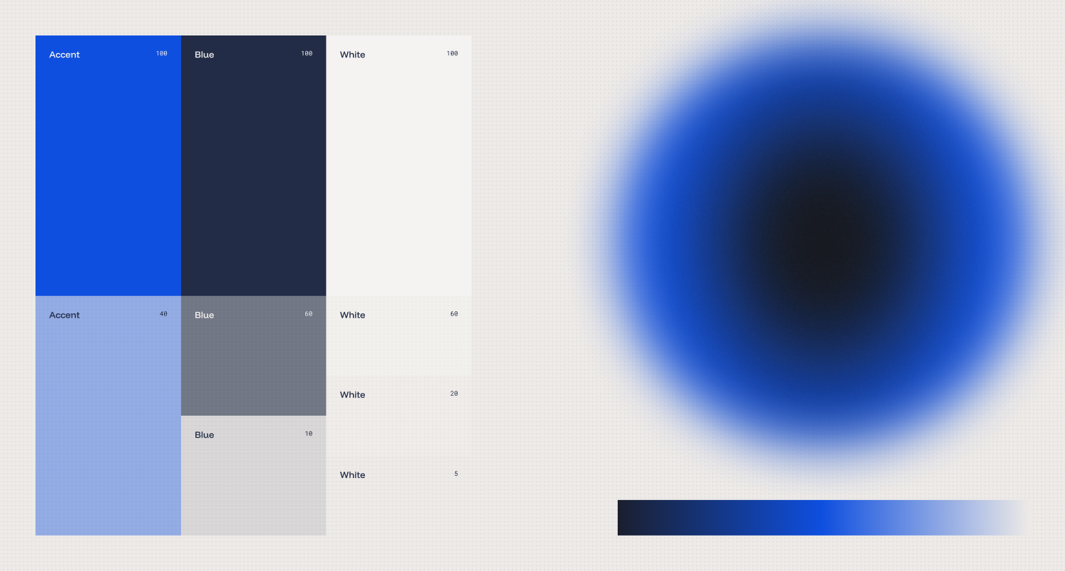
They wanted the system built around one specific shade of blue. A flat color would have carried the register without carrying much else, so that single tone opened into a full palette of flat inks and, from there, into two gradients that behave in opposite ways.
The radial one works as an atmosphere, a field pooling and stretching the way light behaves, sitting behind the content and giving every surface depth. The linear one works as an accent, a directional mark used on underlines and dividers.
Underneath it all sits a subtle dot matrix that registers accuracy and industrial design while letting the content breathe, holding its position regardless of what moves across it.
The matrix and the gradients combined balance depth and organic growth with order and hierarchy.
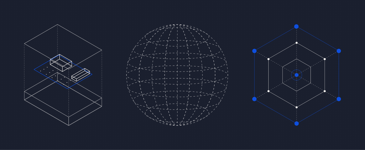
The system was completed by line diagrams, isometrics and conceptual vector graphics, all built in the same technical drawing language of dashed lines and thin strokes.
That language keeps engineering at the center of everything, which is where it belongs for a company whose work is methodical, specific, and measured.
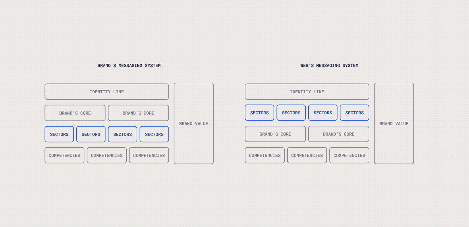
Running alongside all of that was a different question, which is how you explain everything Cranes does effectively.
Their brand scheme runs inward out, with the core message at the top and, hanging from it, the sectors they serve and the competencies they own. Arguably that is the right order for explaining a company to itself, yet it is not necessarily the best navigation system for a website.
We both knew that clients would come in and go directly to the content that speaks to them:
- Do they work in my sector?
- Who have they worked with?
- What solutions have they made?
Reframing that scheme into a user-first narrative was where most of my work sat, and it is what lets the message reach whoever needs to hear it, in their own context.
What they asked for was a site that could lay out everything they do without feeling like a marketing landing page or like they were selling a product.
Cranes is not trying to sell you anything here, it is establishing what the company is and what it does, and the site works as the central hub of the entire identity. That shows up in the copy they wrote and in the navigation and content structure I gave them to write it against.
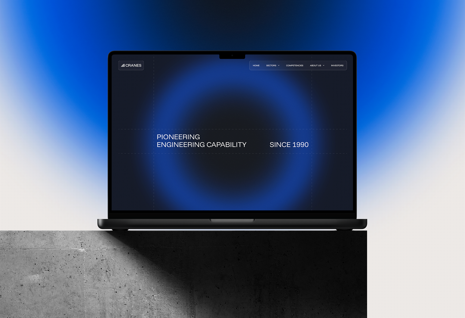
At the same time, they wanted something that would surprise their shareholders and their clients, so the interactions and the animations were a fundamental part of the request.
Each space got the construction that suited the level of interactivity it needed: a 3D frame sequence that reacts to the scroll of the page, vector Lottie animations elsewhere, and page load animations across the different pages.
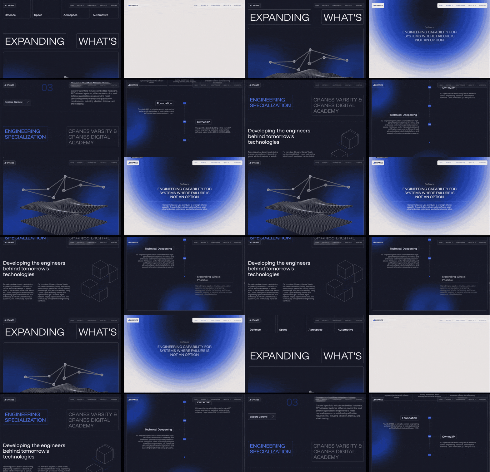
This was a collaborative project in the most literal sense.
They knew where they wanted to land conceptually and how they wanted to be positioned, and the work was building the bridge between where the company stood and where it wanted to go, through an identity and a visual system that only fully take shape on the new website.
Everything in the project points back to the same thing, which is a company with thirty years behind it reintroducing itself to the world.
The finished website is live here.