Dream Management is a Los Angeles–based short-term rental company built by owners, for owners.
I led the brand from the ground up, shaping a concept, a voice, and a visual system that could earn a property owner's trust and turn it into the company's main engine for new leads.
The website, where the brand comes together most fully, carries the visual design I built for it. You can check it out here.
Dream Management is a short-term rental company based in Los Angeles, built by people who own and rent properties themselves.
They came to me with the business already figured out. What they were missing was the brand: the thing that would carry their message from the first impression and pull the business forward. For a company that lives or dies on bringing in new owners, that brand had to work as the bridge between knowing what they do and getting someone to reach out.
I led the brand from the ground up, defining the positioning, the concept, the verbal and visual identity, and the way Dream talks to its two audiences across every channel.
From there I designed how it shows up in the real world, from social posts to owner-facing decks, all the way to the website, the brand's fullest application.
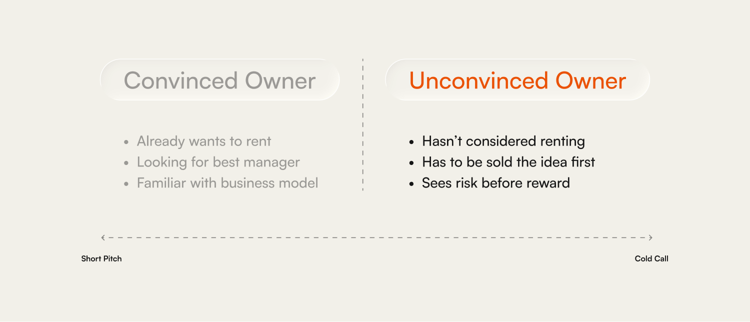
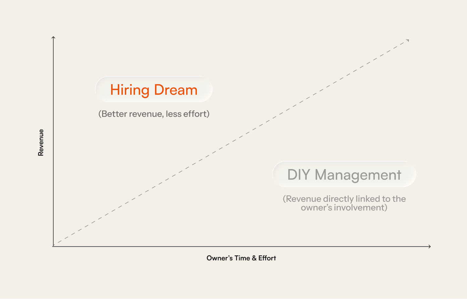
Most rental management brands sell to guests, whereas Dream's main target is property owners. And winning them over is a harder conversation than it sounds.
Some owners already want to rent and are just looking for the best manager to do it. But a lot of the people Dream wants to reach have never seriously considered renting their property at all, so convincing them is much closer to a cold call than a pitch, because first you have to plant the idea, and only then earn the trust to act on it.
That second owner is the difficult one, and the one the brand was built for. They are being asked to hand over an asset they paid for and let a stranger run it while they step back, and underneath any interest there is fear: of losing control, of the house being mistreated, of the whole thing turning into more trouble than it is worth.
So the real job of the brand was to make a nervous owner feel like they were in safe hands before they ever reached out, moving them from "this sounds risky" to "I want to talk to them".
The fuzzy part of their company was that they were struggling to define what they did in two lines, what their actual hook was.
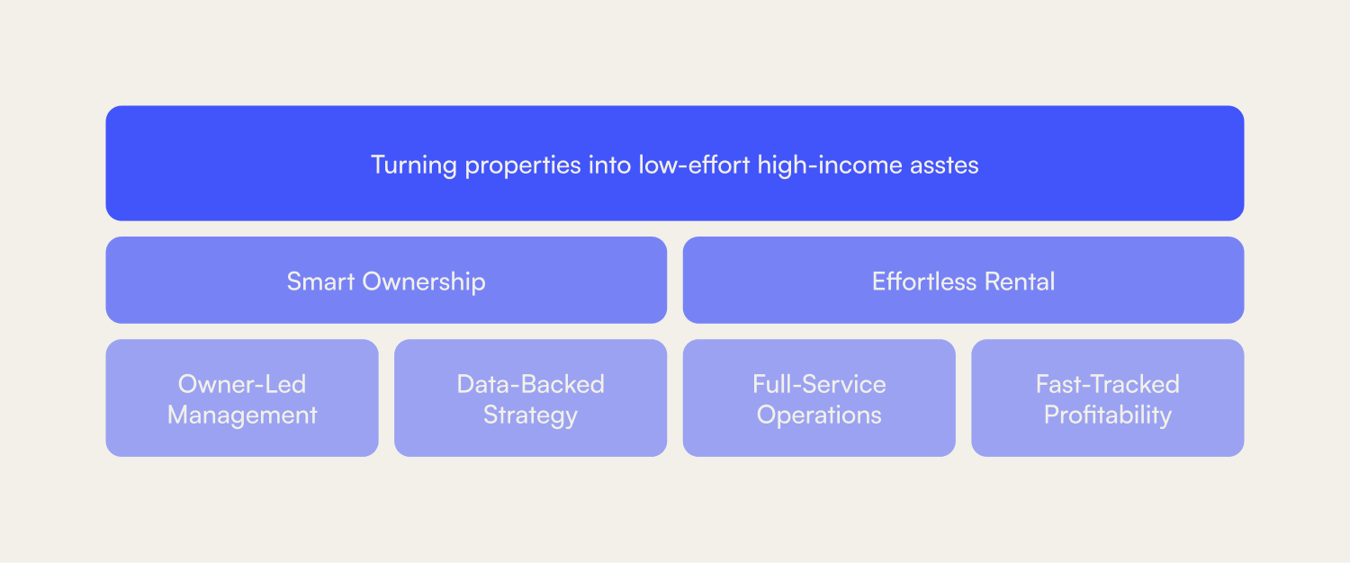
Eventually we landed on the idea that Dream turns a property into a low-effort, high-income asset. The owner keeps the upside of the investment without touching the day-to-day, almost like holding a stock instead of running a business, and that became the core of the whole brand.
That promise stands on two ideas that carry everything:
- Smart Ownership, getting the most out of the investment through experience and data.
- Effortless Rental, taking the operation off the owner's plate entirely.
Together they are the entire reason an owner would choose Dream over managing alone, or over not renting at all.
Underneath those two ideas sit the four things Dream actually delivers, the pillars that turn the promise into something concrete: owner-led management, data-backed strategy, full-service operations, and fast-tracked profitability.
Finding how to portray those offerings is just as important.
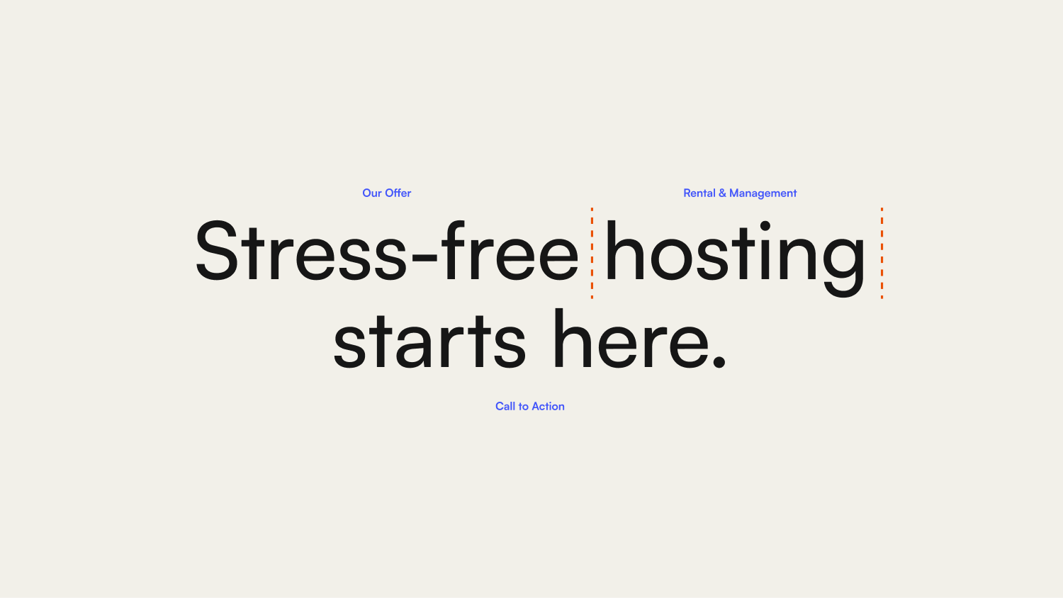
To convert, Dream had to find a tone that sits between sounding confident enough to be trusted with your house and human enough that you would actually want to. The owner needs to feel guided and accompanied, not like they are handing their property to someone who only sees a number.
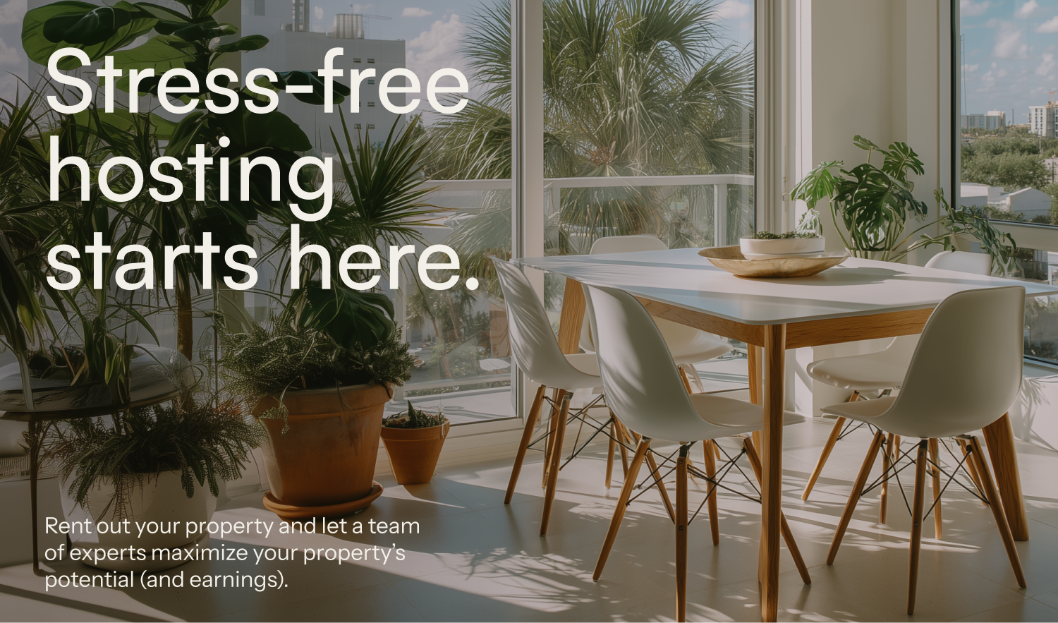
"Stress-free hosting starts here" became the main line because it puts the owner's real feeling first. Not the returns, not the data, the relief.
The same balance the voice had to strike (results and humanity) the visuals had to strike too.
The identity needed to show the analytical, data-driven side of the business and the warm side of a company run by people who answer the phone. Too corporate and it reads cold. Too friendly and nobody trusts it with their investment.
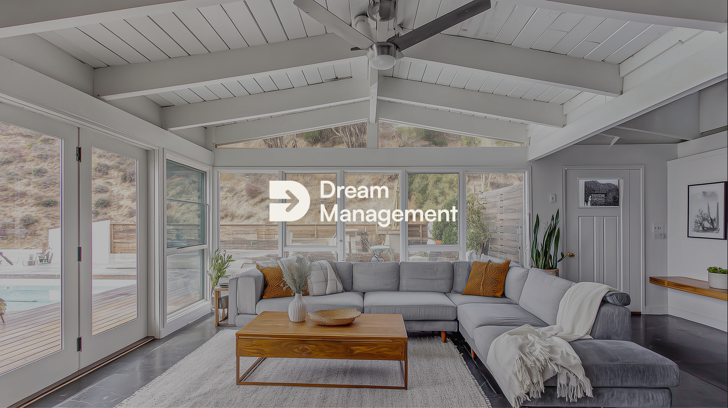
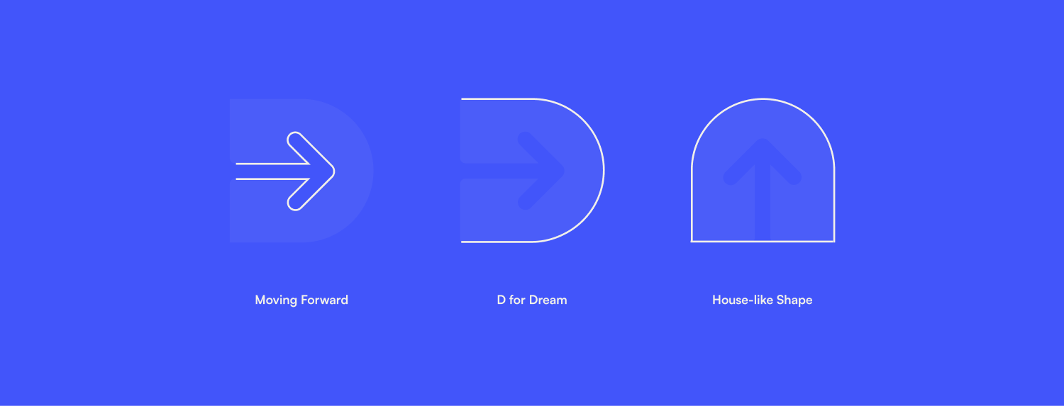
That balance had to live in the smallest details, starting with the logo: a "D" shaped like a house, crossed by an arrow moving forward. Home and progress in the same shape, which is more or less the whole proposition.
There was also a conversation early on about the kind of properties Dream wanted to attract.
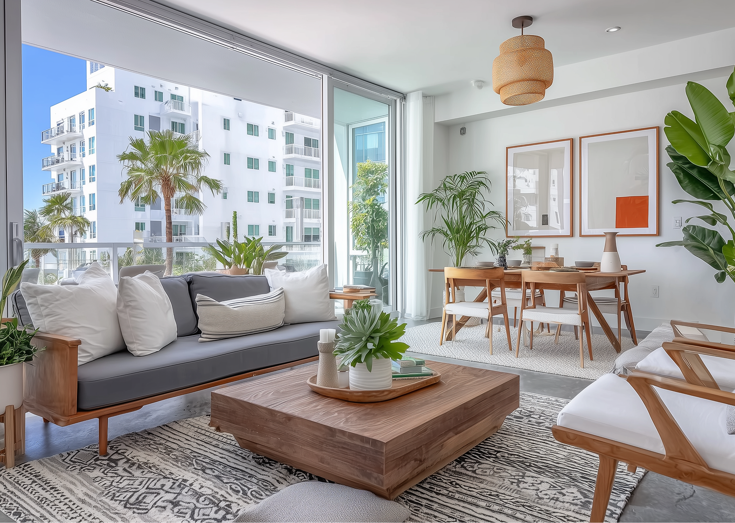
To define that target visually, I used AI-generated imagery to build a library of aspirational homes.
These were never presented as listings Dream manages. They were a strategic picture of the properties the brand wants to bring in, a way of pointing the identity at the right owner before that owner exists.
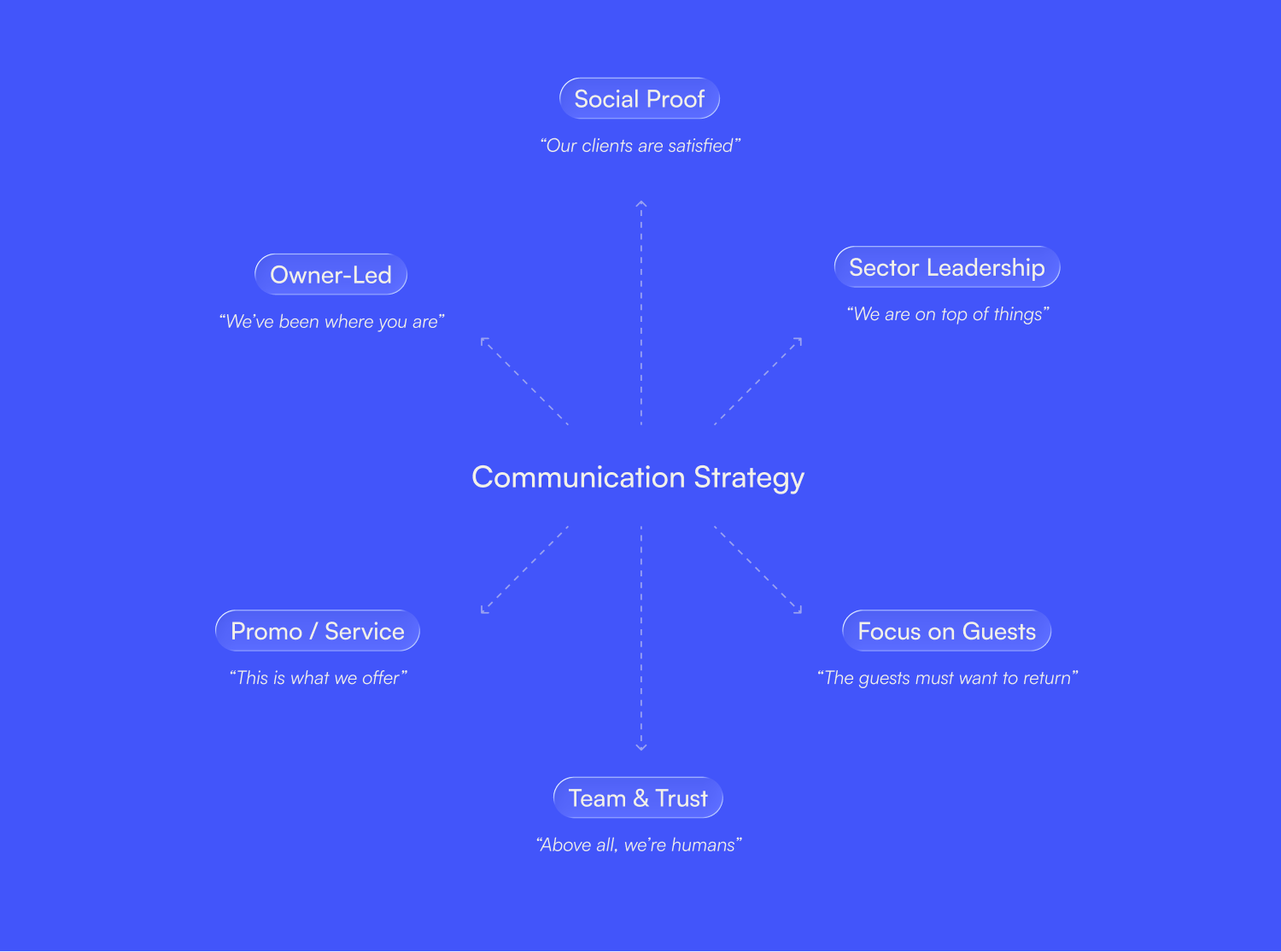
Everything Dream says runs on a set of communication pillars, each one a different angle of how the brand wants to be seen.
They exist so the brand never has to improvise. Whatever the topic or the format, there is already a clear reason behind it and a consistent way to talk about it, which is what keeps a young brand from sounding like a different company every time it posts.
Together they hold the message steady no matter where it shows up.
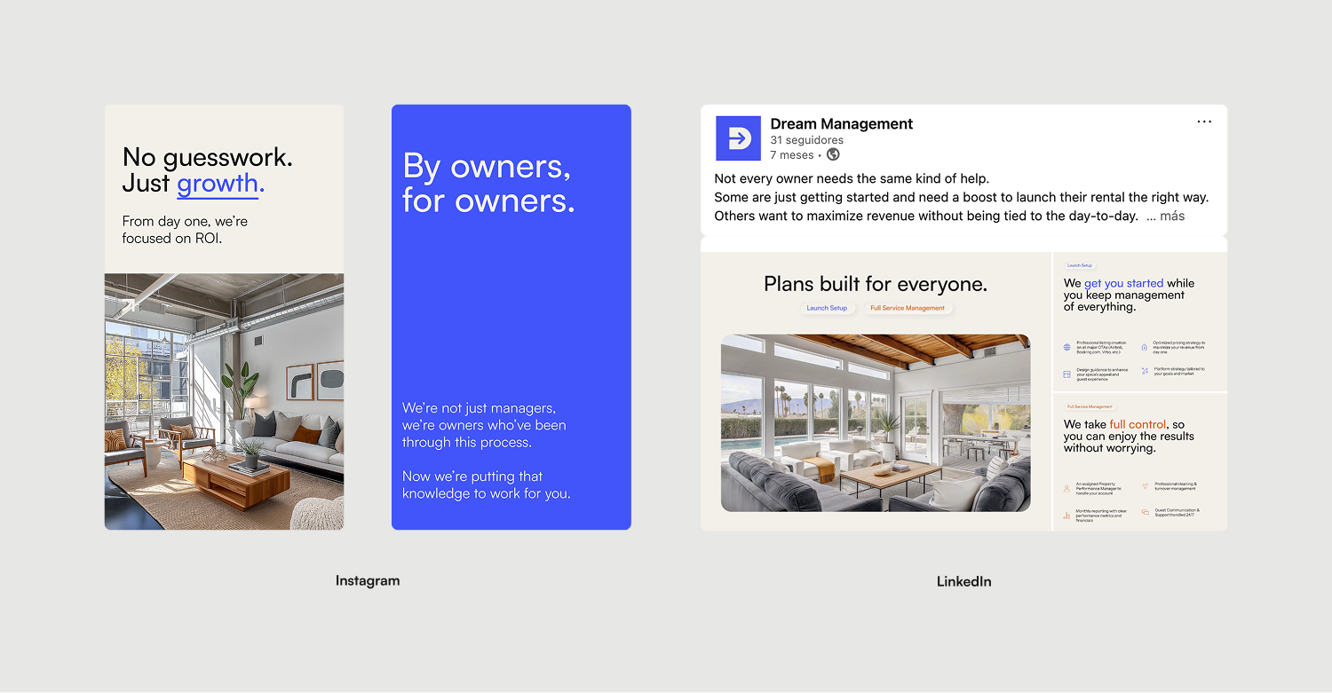
Then each platform gets its own version. On Instagram, Dream is the brand. Short lines, strong images, social proof, the human side. On LinkedIn, Dream is the company. Longer thinking, market insight, the credibility that makes an investor-type owner lean in.
Different rooms, different volume, same message, all of it pointing back to the contact form on the website.
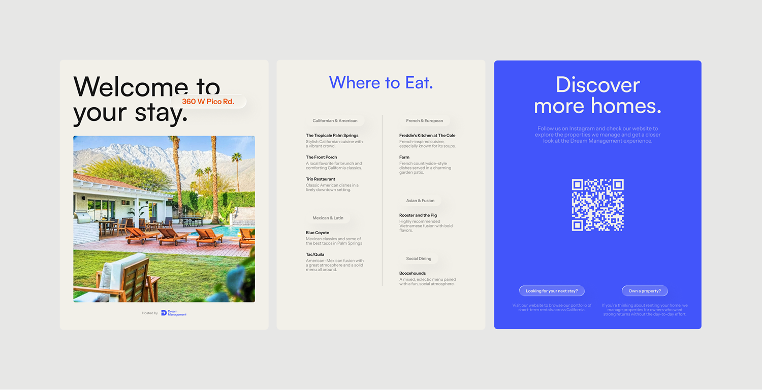
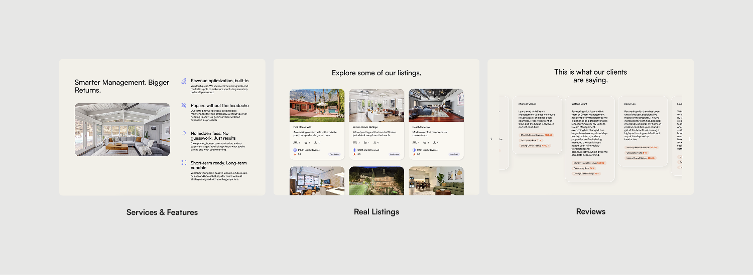
The website is where the brand actually does its job. It is the place every channel sends people to, and the place where a hesitant owner turns into a lead, so the whole site is shaped around that single conversion rather than around showing off houses.
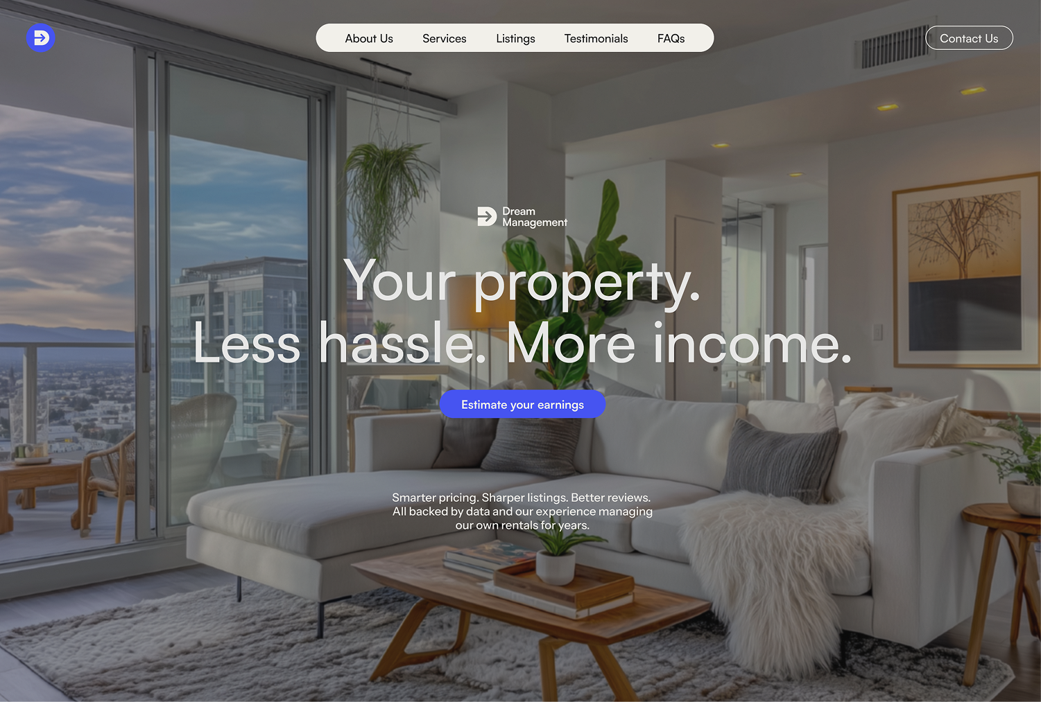
It seeks to lower the owner's guard step by step until the contact form feels like the natural next thing to do. It opens on the promise, backs it with proof and properties, stays transparent about how the numbers work, and lets the founder's own story carry the owner-to-owner idea the brand rests on.
I designed the look of the site to feel familiar enough to navigate without thinking, using the patterns an owner already knows from the rental world, and refined enough to feel like Dream and nobody else.
Dream came in asking for a brand that looked the part, and what it really needed was a way to make a cautious owner trust them.
So every piece pulled toward that one goal: a concept that frames a property as an easy investment, a voice that guides instead of sells, a visual identity that feels both sharp and human, and a website that turns all of it into a conversation.
What started as a request for visual branding became the whole logic of how Dream presents itself, from the first impression on a feed to the moment an owner decides to pick up the phone.