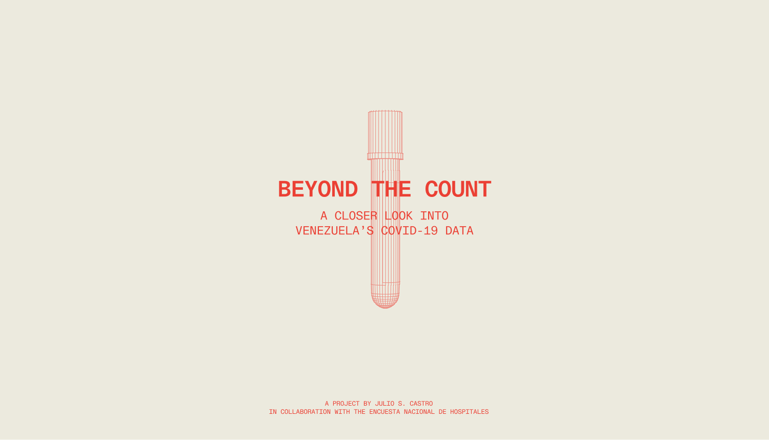
Beyond The Count is a data visualization project that puts a government's official numbers to the test.
During the pandemic, data became crucial, driving decisions in real time, country by country, all at once. So the count mattered more than usual, which makes it worth asking what happens when the government doing the counting has a long record of hiding what it wants to hide.
I took Venezuela’s official figures and held them against data hospitals recorded directly and the models that estimated the real spread, and turned all of it into one visual story anyone can follow.
It was my master's final project, and I led the whole thing, from auditing the data to building the site it lives on.
This project was made using data from the Encuesta Nacional de Hospitales.
When the pandemic hit, data became the thing everyone watched. For once, the numbers weren't just a record of what happened, they decided what happened next: when to lock down, when to open, where to send what little help there was.
Therefore, if the data doesn't reflect reality, neither do the decisions built on top of it. And in Venezuela, where institutions have a long record of reporting what suits them, especially in healthcare, the official number was never going to be the whole story.
The project leans on data from the Encuesta Nacional de Hospitales, an independent group that has spent years documenting the country's healthcare collapse by collecting figures directly from hospitals.
When COVID arrived, they turned that same network into a way to track the real toll day by day. I had worked with their data before, and here I took it as the starting point for a harder question: where exactly does the official count break from what hospitals were seeing, and what does that gap reveal?
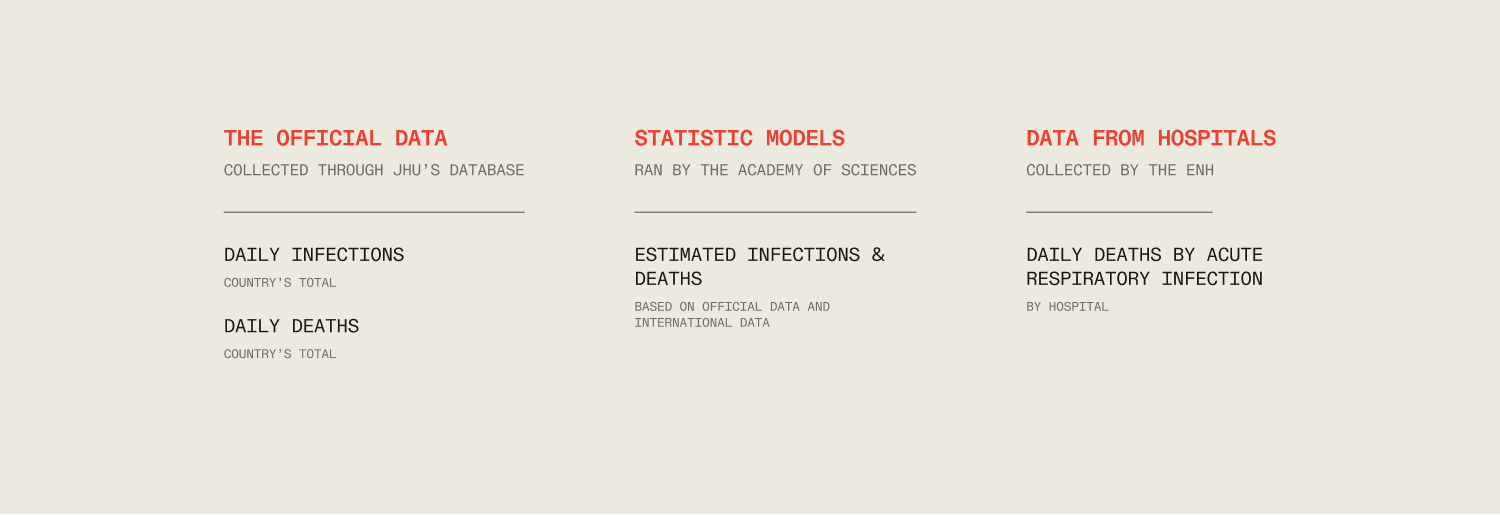
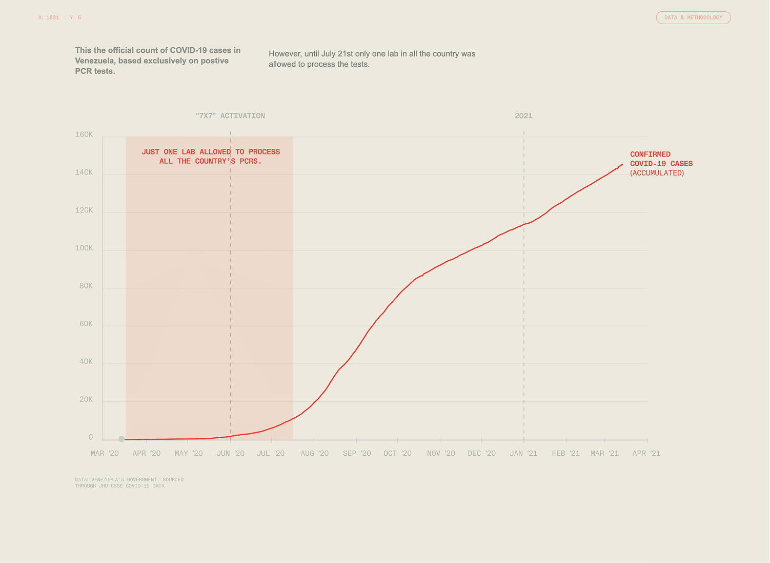
For a while, the government ran a public portal with some real-time figures, thin as they were. At some point it went down, and now those numbers survive only through repositories like the WHO and Johns Hopkins. Being there doesn't mean either institution validated them. They publish what governments report, nothing more, so the official count was effectively a single source with no way to check it from the outside.
And there was good reason to check. This is a government with a long history of going quiet when the data turns inconvenient, down to suspending the weekly epidemiological bulletin years before the pandemic. The difference this time was that the ENH had a network gathering data inside the hospitals in real time, so there was something to hold the official numbers against.
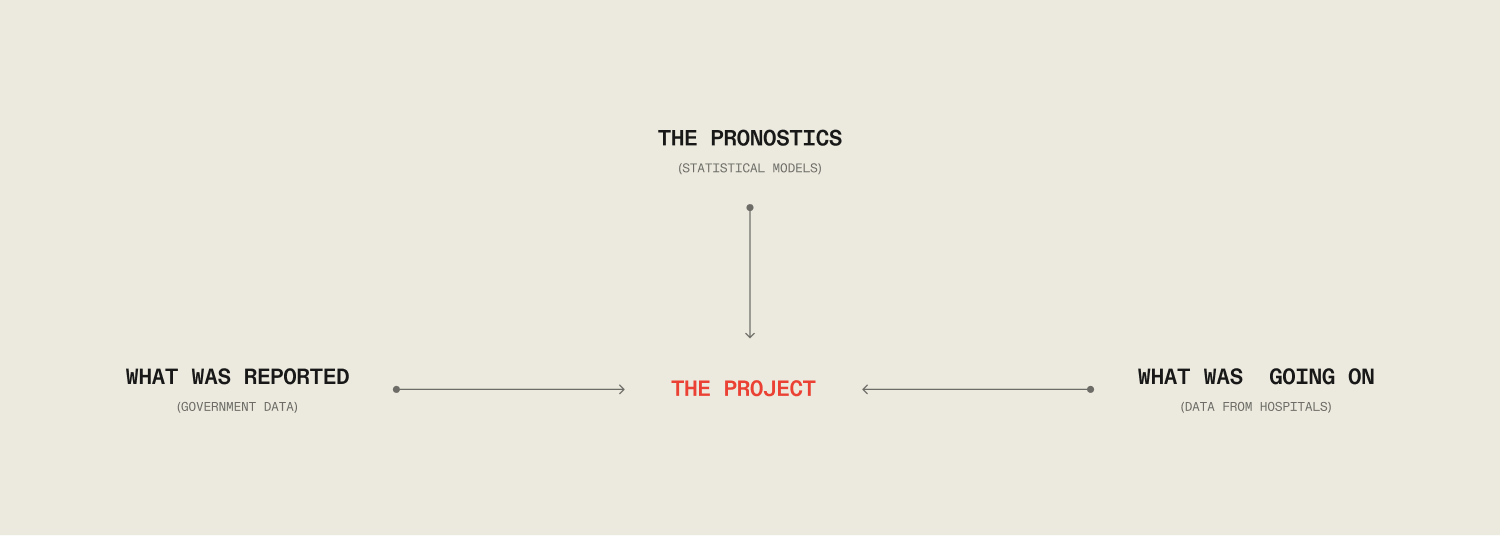
So I put three sources next to each other:
- The official count.
- The Academy of Sciences models, estimating how bad the spread likely was and what the numbers should have looked like.
- Data reported from the hospitals themselves, through the ENH, recording what was actually coming through their doors.
The models and the hospital data told a similar story. The official count told another. The project lives in that distance.
The name carries the whole idea. Beyond The Count means there is more to the pandemic in Venezuela than the official tally of cases and deaths, and the project sets out to find it, how and where.
The closer you look, the clearer it gets that the official count was built to miss things.

It starts with how a death got counted.
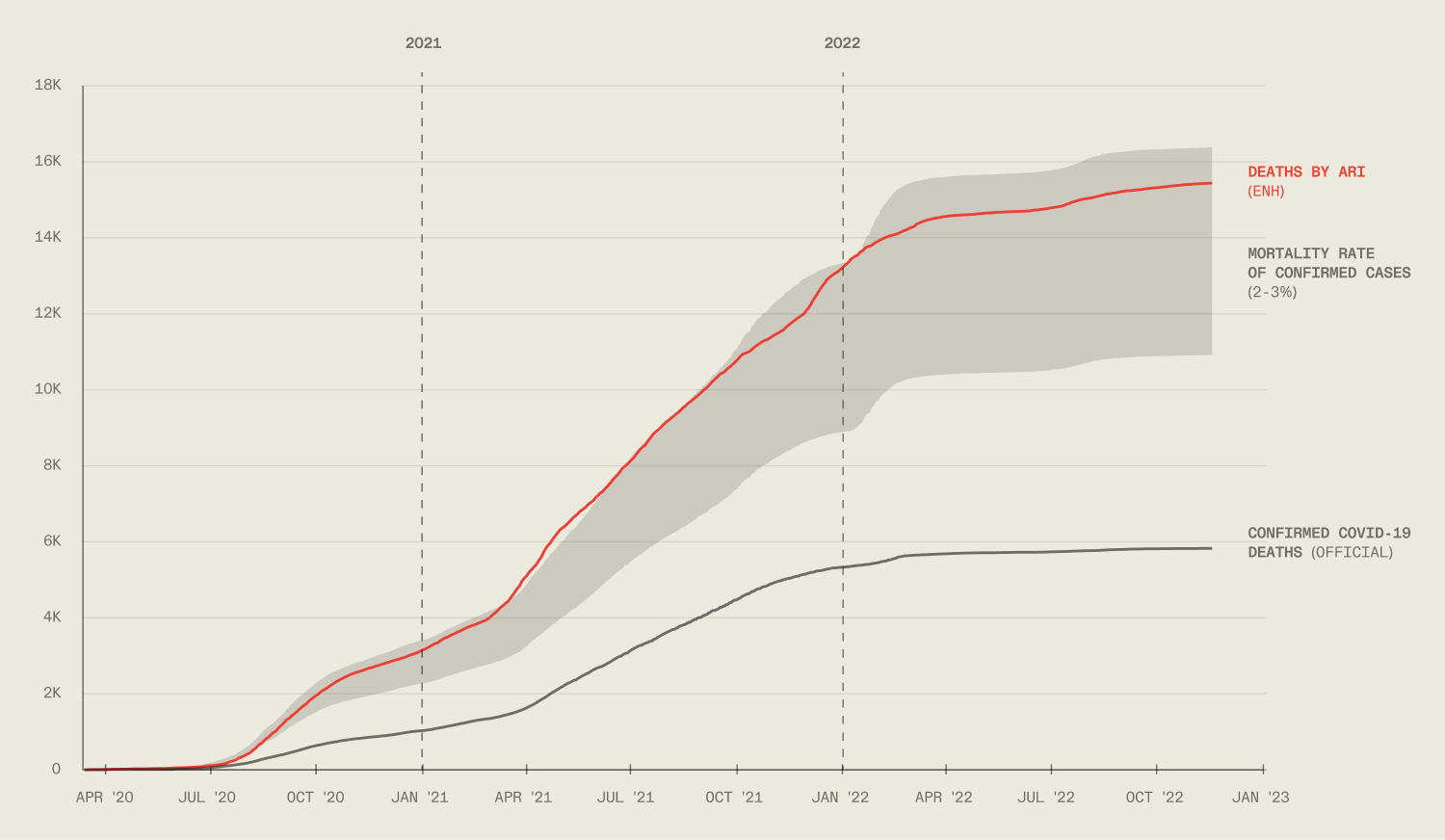
For a death to be officially attributed to COVID, the patient needed a positive PCR test signed before the death certificate.
With testing centralized in a single national lab early on and results taking eight days on average, many died before any confirmation arrived, so they never entered the count as COVID deaths.
Parallel to that count, the ENH tracked deaths from severe acute respiratory infection, the same clinical picture COVID produces, as a stand-in for the deaths the official system couldn't register. It undercounts too, by its own nature, and yet it still sits far above the official one.
So the project isn't really about a virus. It uses COVID, something every country went through, to show how an institution can shape what gets recorded and what quietly disappears. The pandemic is just the clearest place to see it.
Chart: deaths by covid-19 reported by the government, death estimations based on people infected (official / Academy of sciences) and deaths by Acute Respiratory Infection (ENH).
For this project, the challenge was less in the data itself and more in turning three different and dense datasets into a linear storyline a person could follow without a background in epidemiology.
So I built it as a sequence that follows the doubt the way it actually builds.
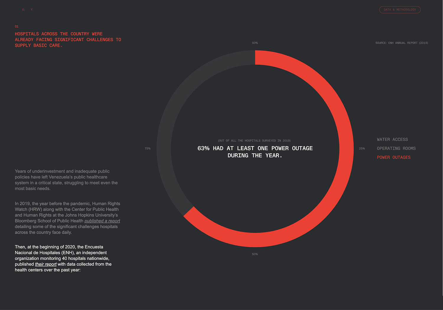
It starts with motive. Venezuela's hospitals were already in crisis before COVID, something the government had spent years denying, and this is an administration with a long record of going quiet on any data that exposes it, from the economy to elections to a health minister fired the day after she published real mortality figures.
Showing the true scale of the pandemic would have meant admitting the collapse underneath it.
Screen showing the hospital’s conditions before covid arrived, using ENH’s data from previous reports.
That motive is what makes the doubt reasonable, so the next step examines the official count on its own terms: how cases were tallied, under what protocols, with testing run through a single lab for months. Seen up close, the count starts to come apart from the inside.
Then comes the question that keeps the project honest. If the official numbers fall short, why trust the alternatives? Because they agree with each other. The Academy of Sciences' models and the ENH's hospital data land in the same place, and that place matches the mortality rates of neighboring countries. Two independent sources and a regional benchmark pointing the same way is what earns them the right to be the measuring stick.
Only then does the story arrive at the real subject: what the pandemic actually did to a healthcare system the official count was built to keep hidden.
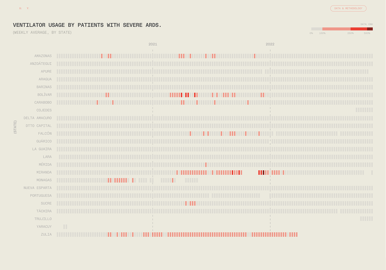
Screen with ENH’s data of ventilator usage by patients with severe ards during the pandemic.
The look had to do conceptual work, not just hold the data.
The whole project is about transparency, so the design had to feel like it too: precise, technical, nothing hidden.
The reference was early digital interfaces, the bit and the grid. That meant high contrast and a tight palette of cream, black and a single red, with monospaced type carrying the parts that needed to read like raw data.
All of it sits on a strict grid with a lot of white space, which keeps the charts as the focus and stops a dense subject from feeling heavy on screen.

The test tube icon drawn in wireframe pulls it all together. The test tube ties straight back to PCR testing and the medical world the project lives in, and the wireframe is the point, showing the internal structure of something instead of its surface.
Making the invisible visible, which is the whole investigation in one image.

That logic runs down to the smallest details on the site. The cursor becomes a small red circle, a nod to the infection. A live coordinate readout sits in the corner, a reference to the surveillance and risk that come with collecting this kind of data independently in Venezuela.
Small choices, but they all point back to what the project is about.

All of it comes together as one interactive site that walks you through the investigation from beginning to end. Instead of an endless scroll, it moves screen by screen, like a guided presentation.
Each screen is one step in the argument, which keeps a demanding subject readable and lets someone explore at their own pace without losing the thread.
The animations are a deliberate part of that, built to respond as you move through the site, so the data reveals itself piece by piece instead of landing all at once. They carry the rhythm that keeps the story from feeling like a report.
It also runs on a second page of its own, dedicated entirely to methodology: every source, every limitation, how each number was reached. In a project about transparency, showing your own work is part of the argument.
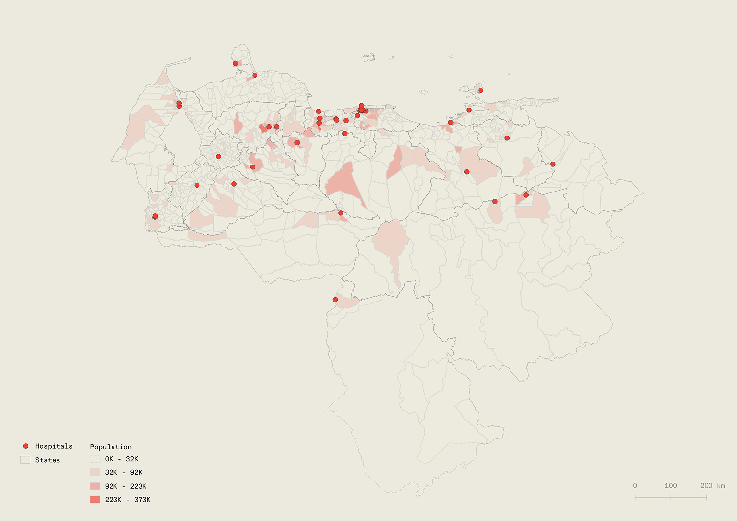
Each hospital's 15 km service radius mapped over Venezuela's population, to estimate how much of the country the ENH actually reached: roughly 60%.
The project started as a question about a number and ended as something bigger.
By putting three sources side by side, it shows that the official count never reflected the real impact of COVID in Venezuela, and that the gap wasn't an accident but the product of how the system was built to record.
COVID is just one case of it. The same opacity runs through the economy, public spending, elections, anywhere the real figures would be inconvenient.
What makes this one land is that everyone went through the pandemic, so the gap is easy to see. And the cost of a system built to obscure instead of inform doesn't show up in the distorted numbers. It shows up in the people behind them.